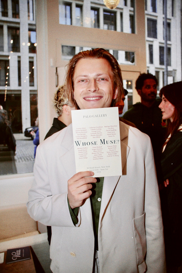
SUNNEI x Media
What inspired the Sunnei x Media series?
Media Issue 2 x SUNNEI is a collaboration that emerged in a completely spontaneous way. The SUNNEI team showed interest in our early publications and asked us to start collaborating, which aligns perfectly with the theme of the magazine: collaboration as a relationship and bond. Thus, it started a dialogue and exchange that led us to the realization of this third issue.
What do you think people should change their perspective on these days?
It might sound quirky, but we believe that people should change their perspective on the concept of perspective itself. We should step away from the unidirectional narrative of the fact and the falsely absolute concept of truth. There are always multiple points of view, and a single topic can be explored in ways that are radically opposite, yet equally valid. Being able to move away from a single vision of reality helps to open up to discussion and dialogue, allowing for exponential enrichment.
Is two really better than one?
Regarding the concept of relations, we believe that in some ways two and one are overlapping concepts. To be “one” implies having a strong relationship between the subcomponents of the “one”, which is a strong coherence of the multiplicity building us to be considered as one. Therefore, the interesting aspect of multiplicity and connection, doesn’t lie in the concept of “one” or “two”, yet it lies in their exchange and their continuous vibration.
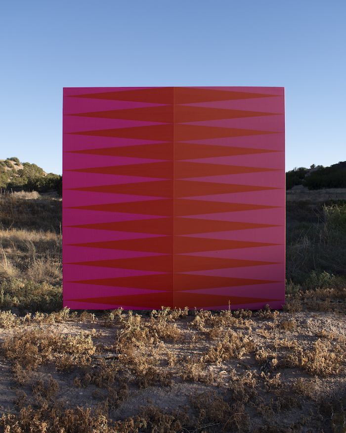
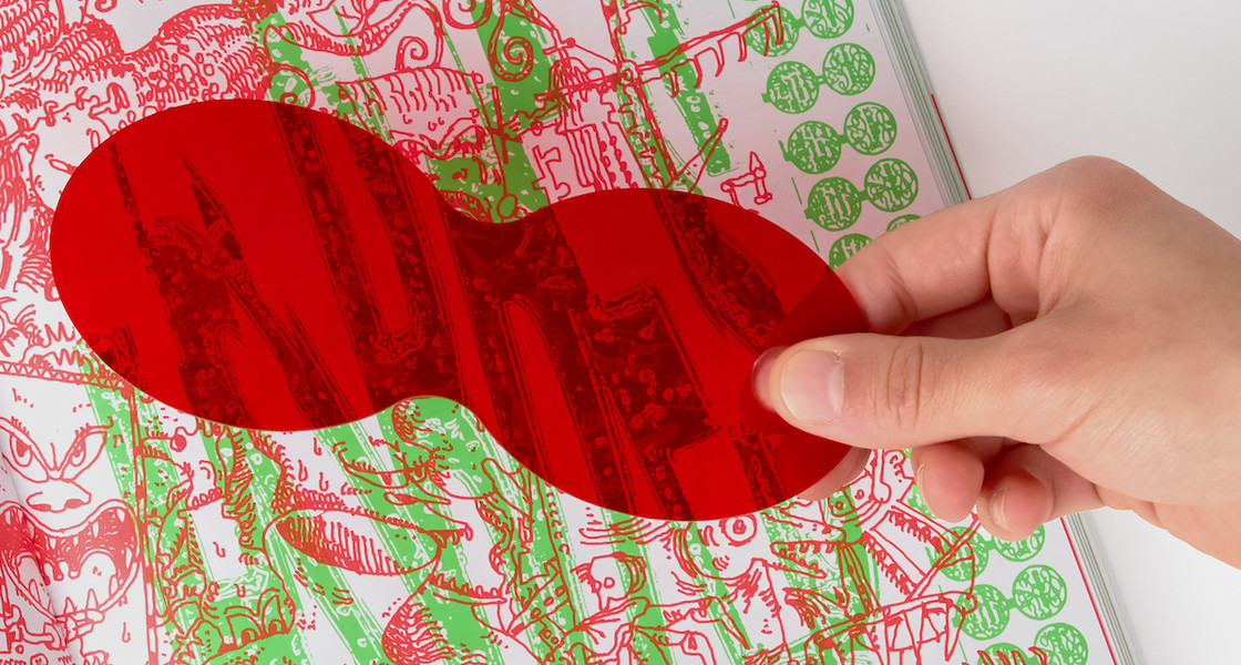
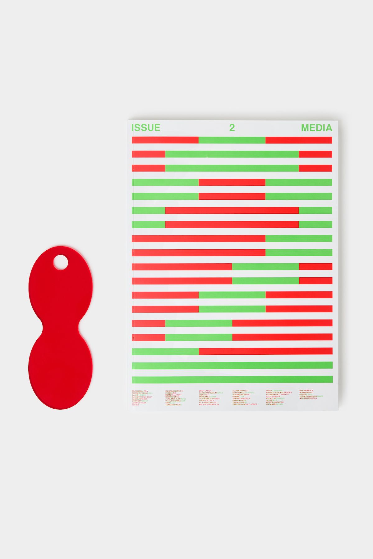
Why green and red?
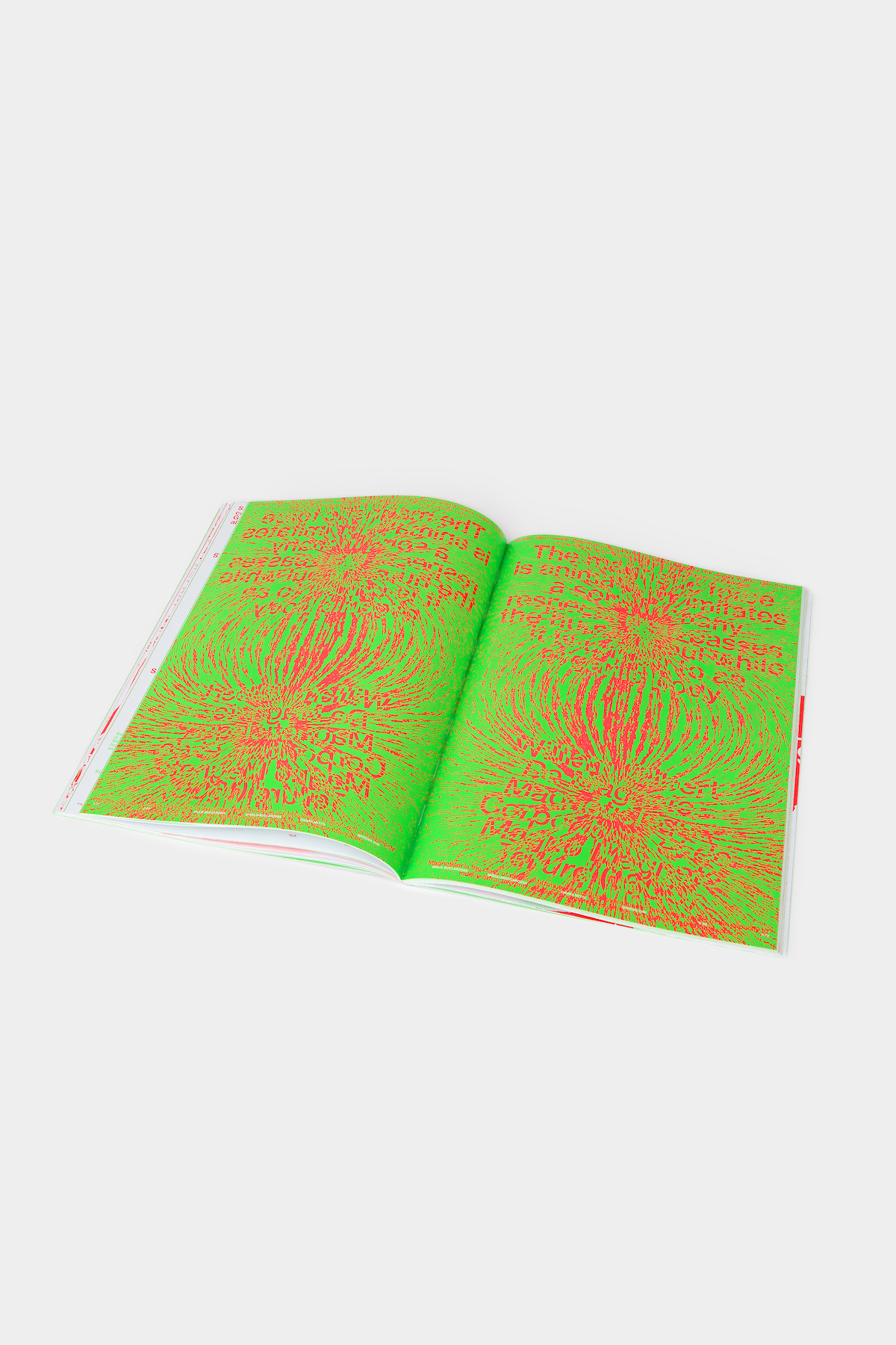
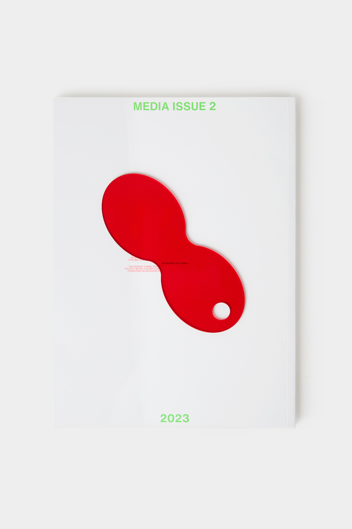
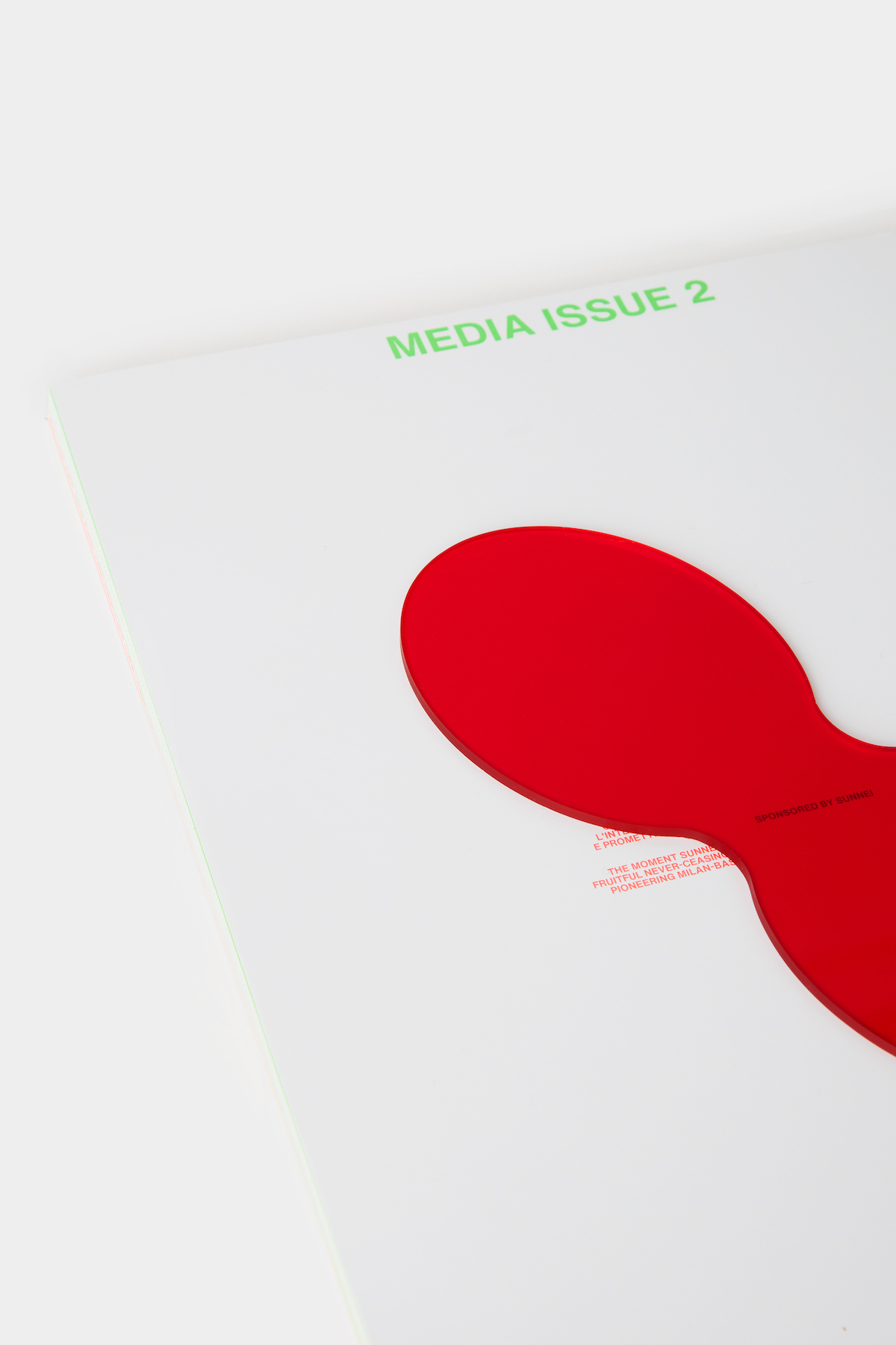
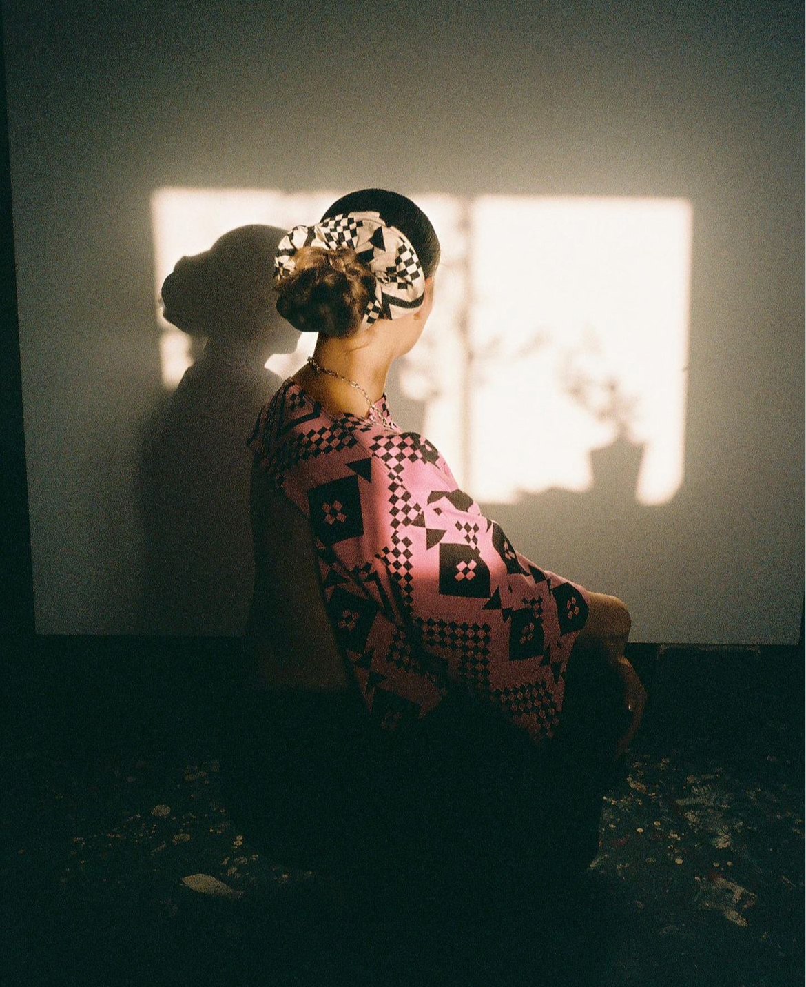
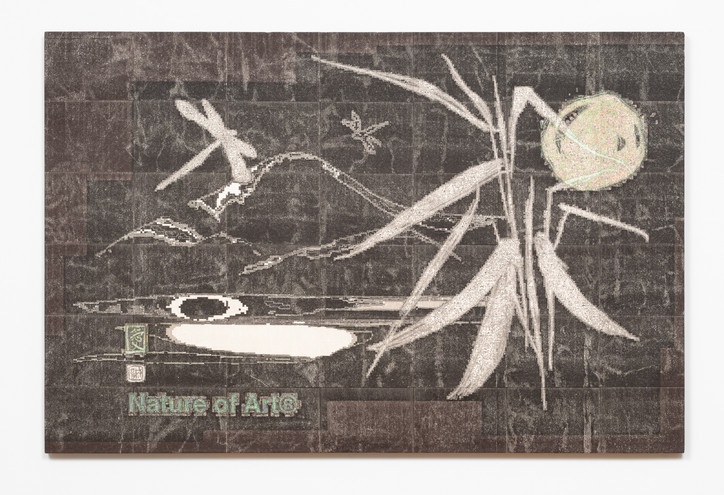
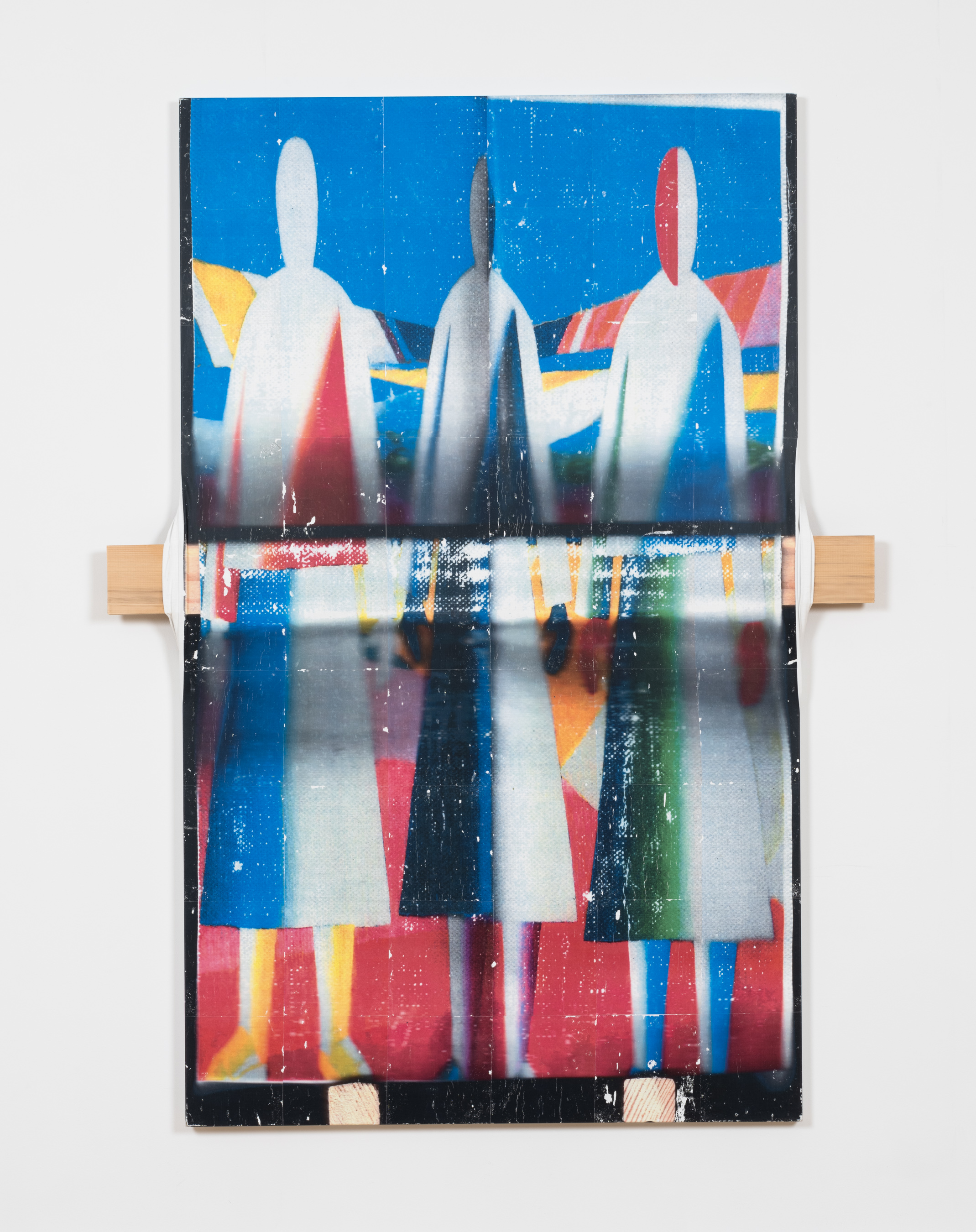
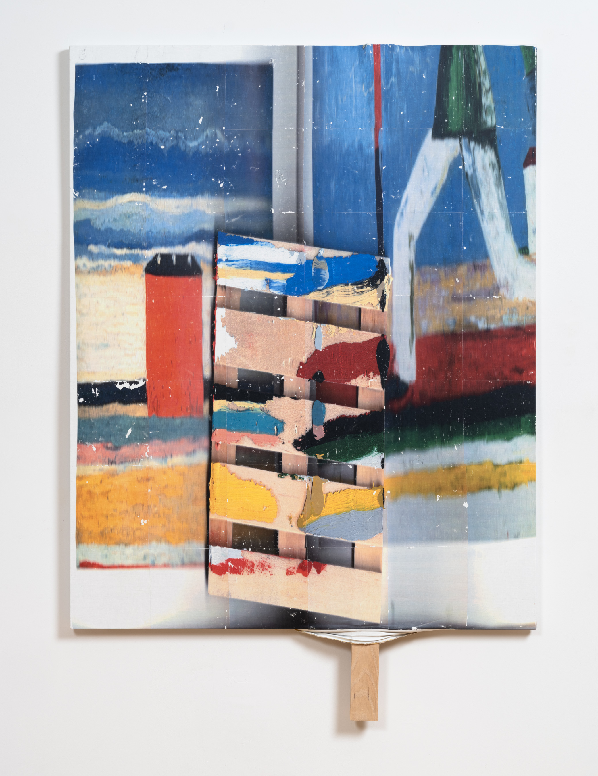
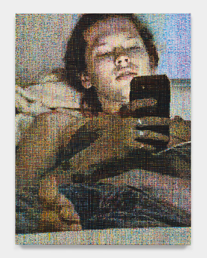
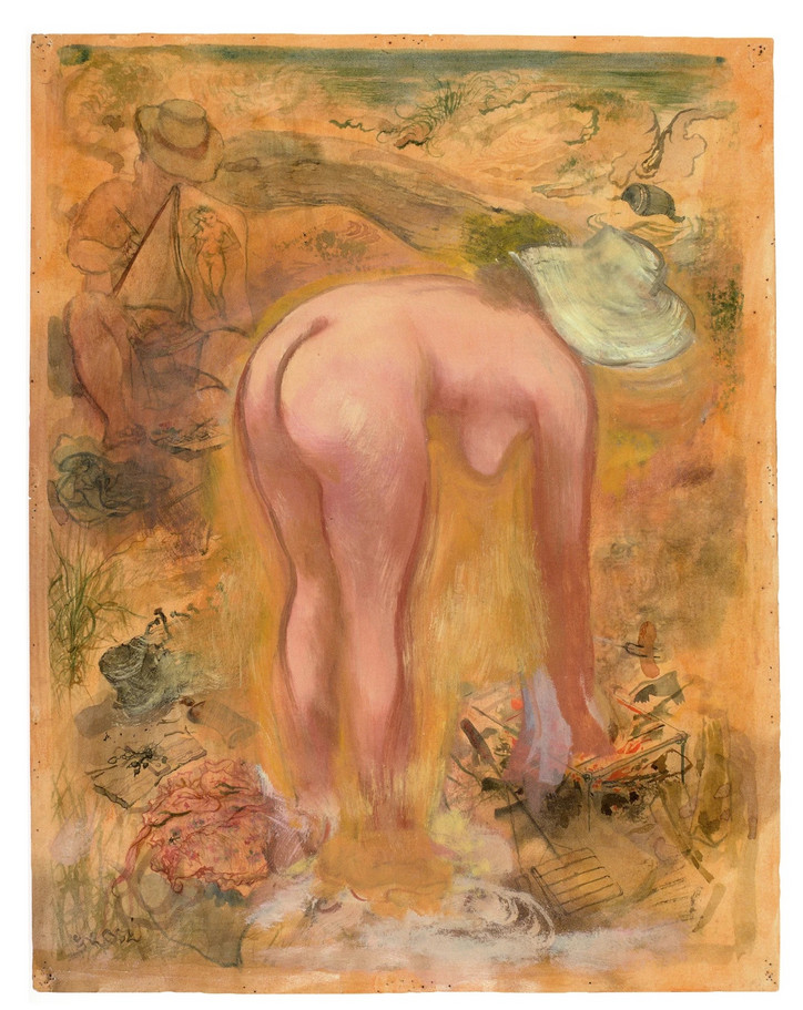
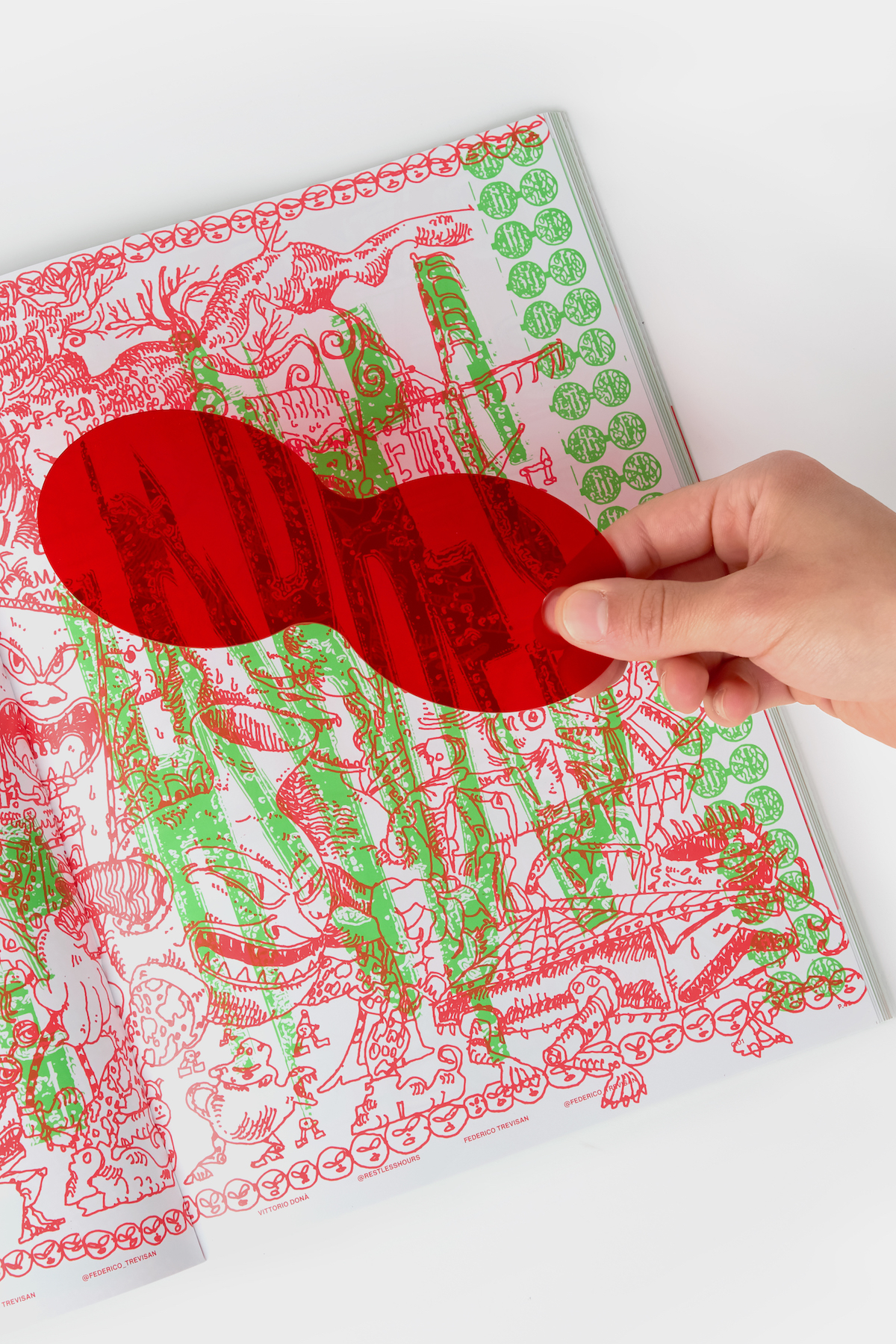
Rather than focusing on specific colors we decided to limit the palette to two colors, for an aesthetic value partially. Additionally, “2 colors for Issue 2” made sense, like the terms of a relation, this double creates a sort of dialogue. The theme of this issue is the relation, understood as a bidirectional interaction between two distinct poles that either sustain or mutually influence one another. Hence, we chose to use only two colors, green and red, and place significant emphasis on their interaction with the aim of creating an active experience. For this purpose, we created the ROSSOVISORE, an acetate tool that hides or highlights illustrations when overlapped. The final illustration is not the one printed in the magazine, not even the one seen through the ROSSOVISORE. It lies in the transition, in the oscillation between the two.
What topics does this installation cover? Why?
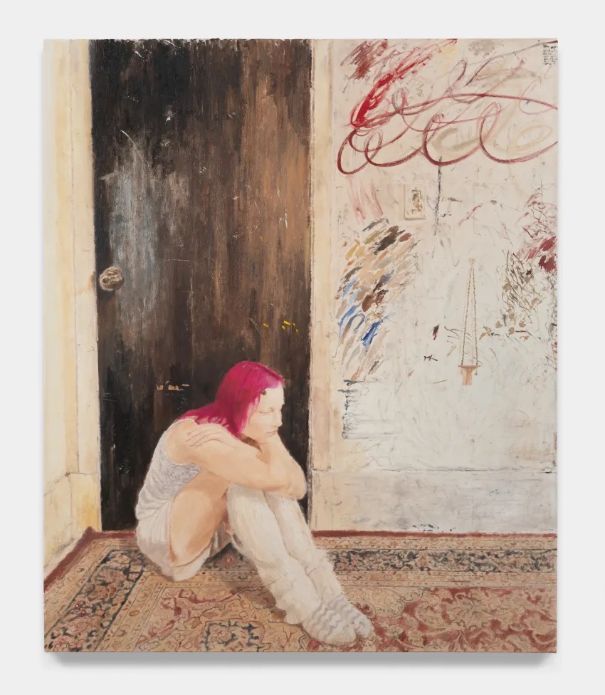
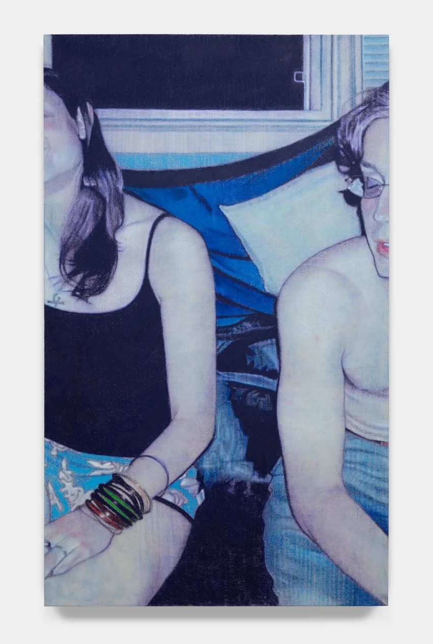
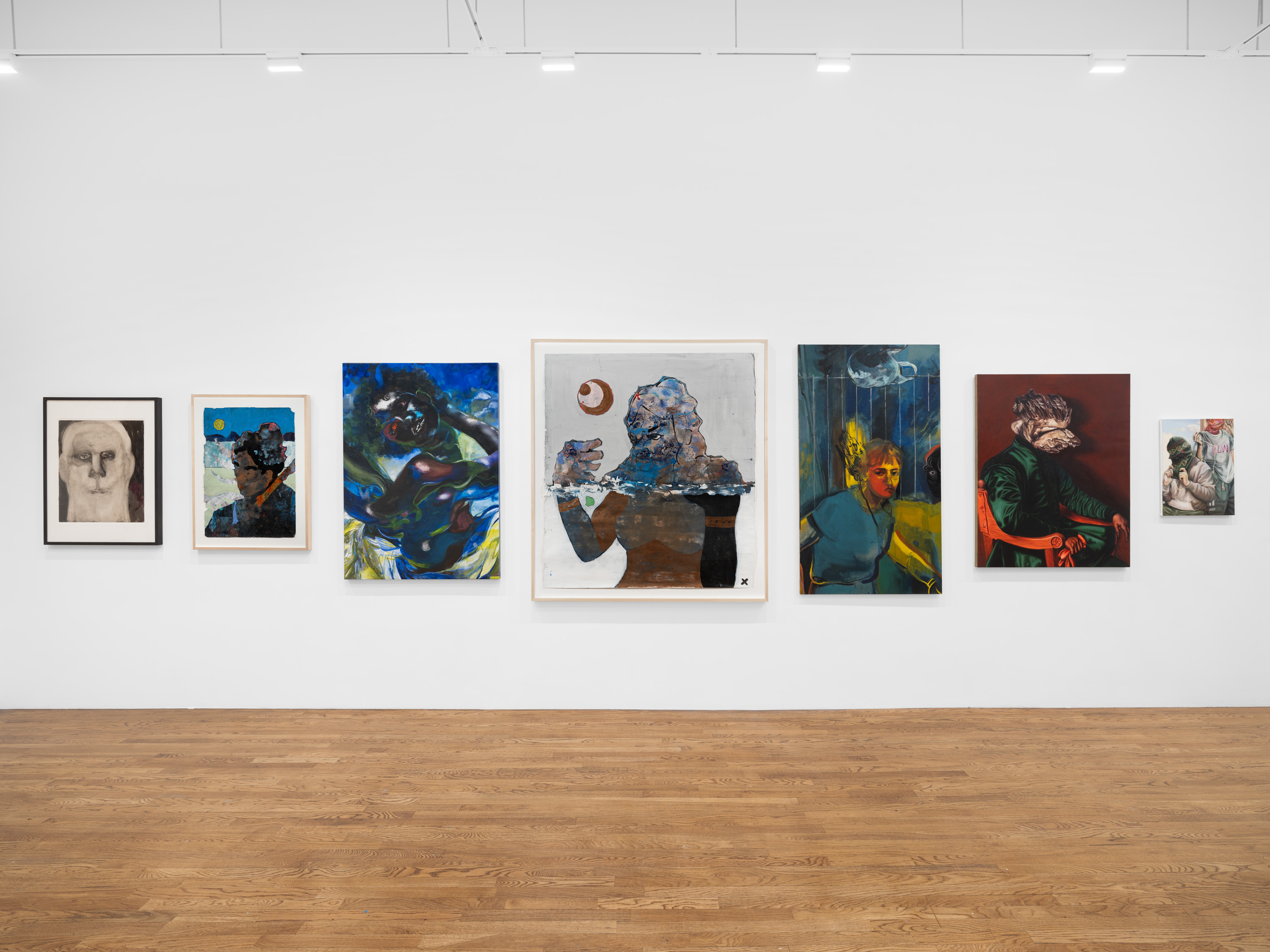
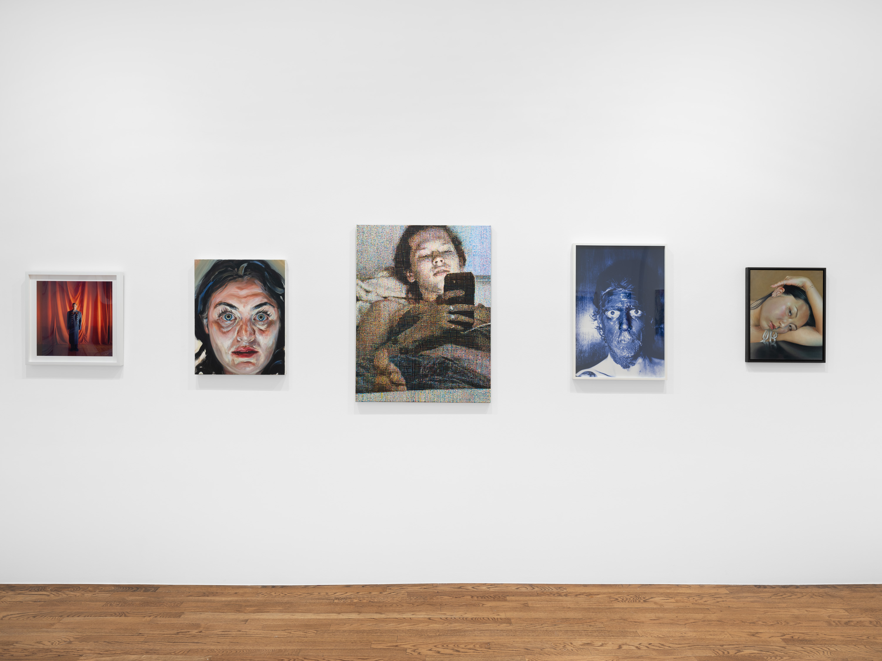
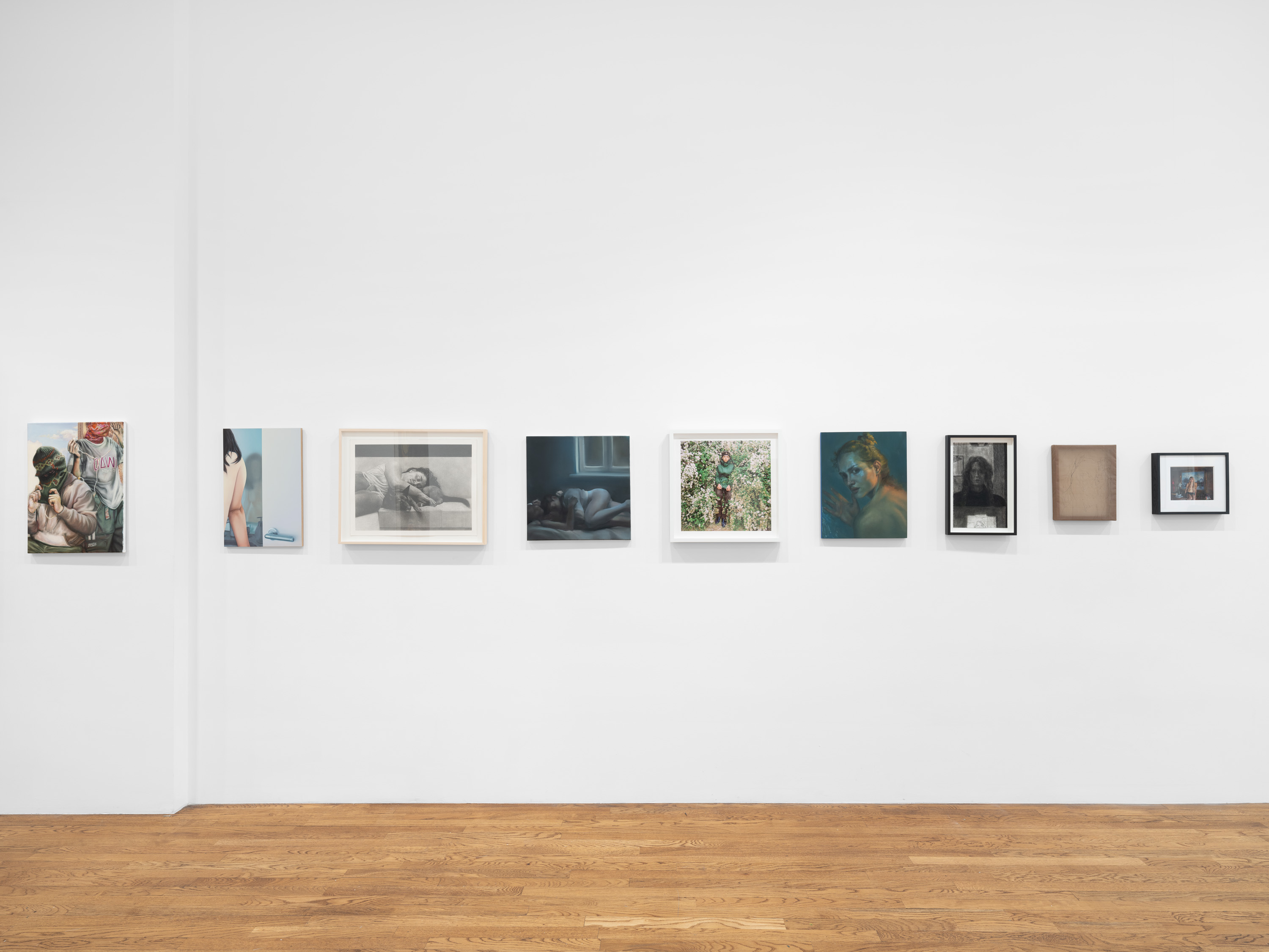
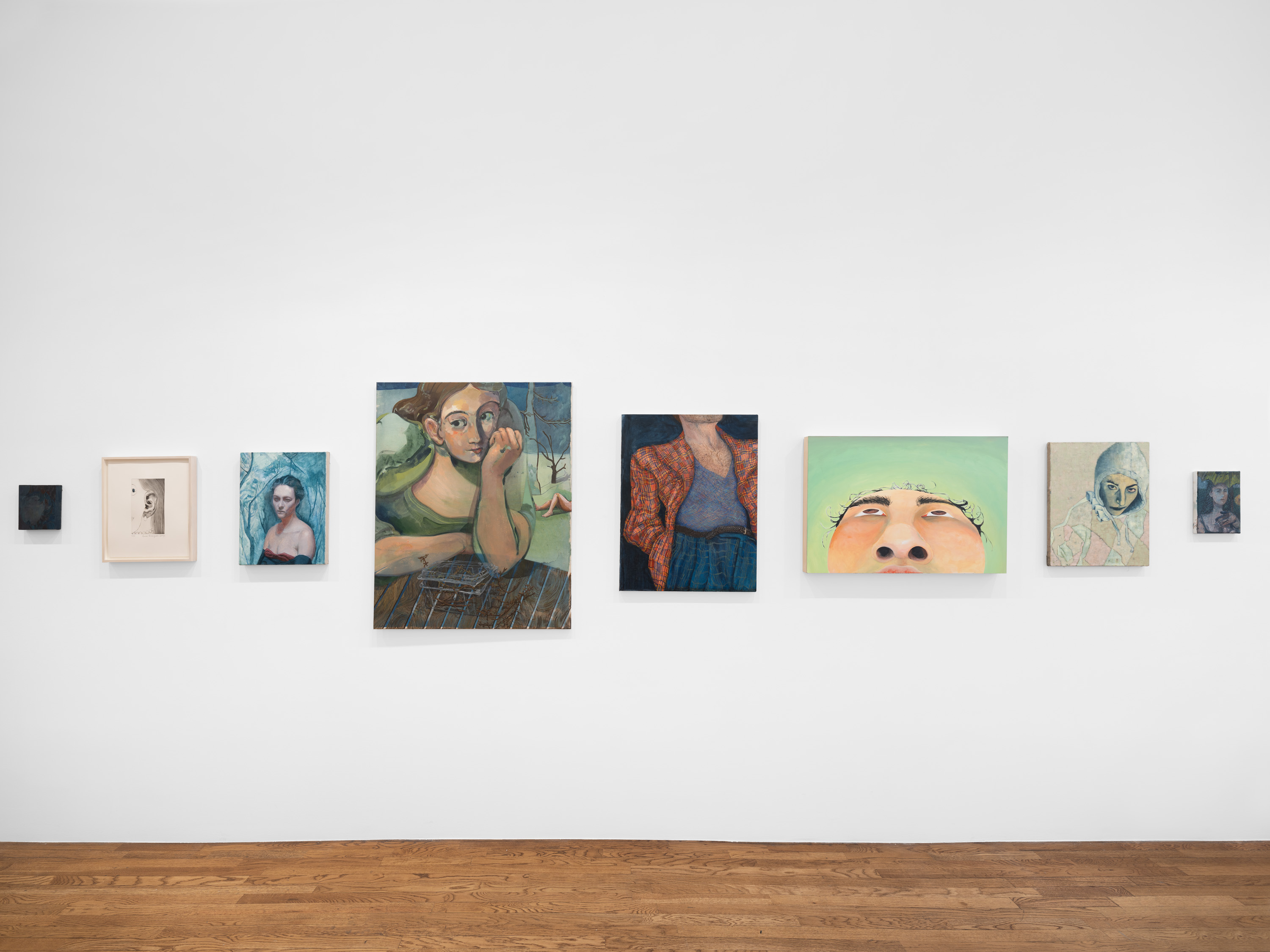
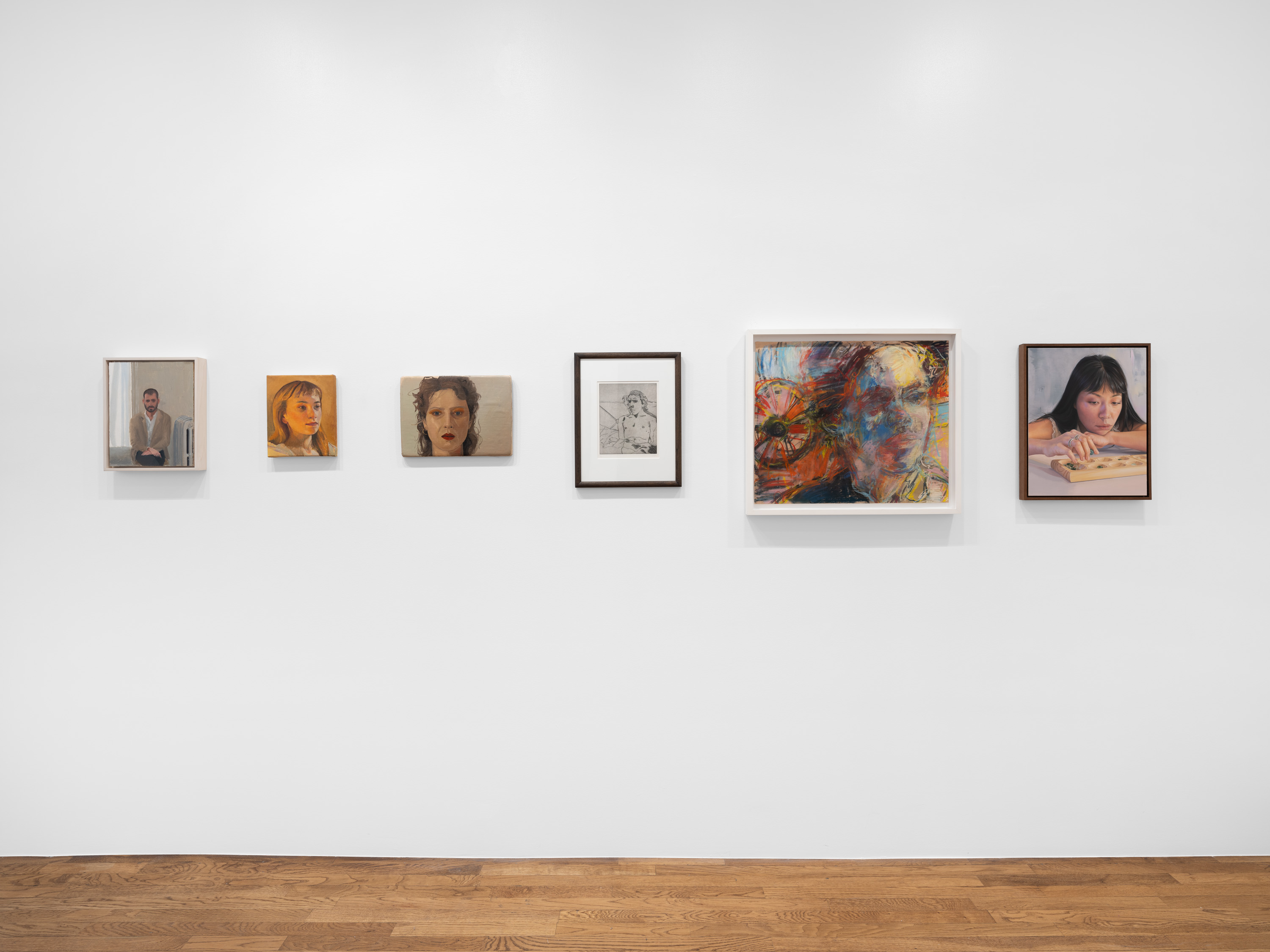
The topic of this publication, as we said, is the idea of relation, connection, bond. This theme can be found in several aspects of the magazine. First of all, it was clearly at the base of the design phase, where we had a continuous exchange with SUNNEI. The theme resurfaces in the illustrations, as each artist was invited to produce their work collaborating with another visual designer of their choice, with the idea that every part of the magazine could contain a collaboration, including texts. In this regard, we chose to develop texts as conversations between Media and guests, inviting them to discuss the idea of connection and relations between humans and various other counterparts. In this way, the theme of the magazine is embodied once again in the form of dialogues. Lastly, as already mentioned, the concept of relations is reflected in the way the images are experienced, as they can be modified and viewed in different ways using the ROSSOVISORE.
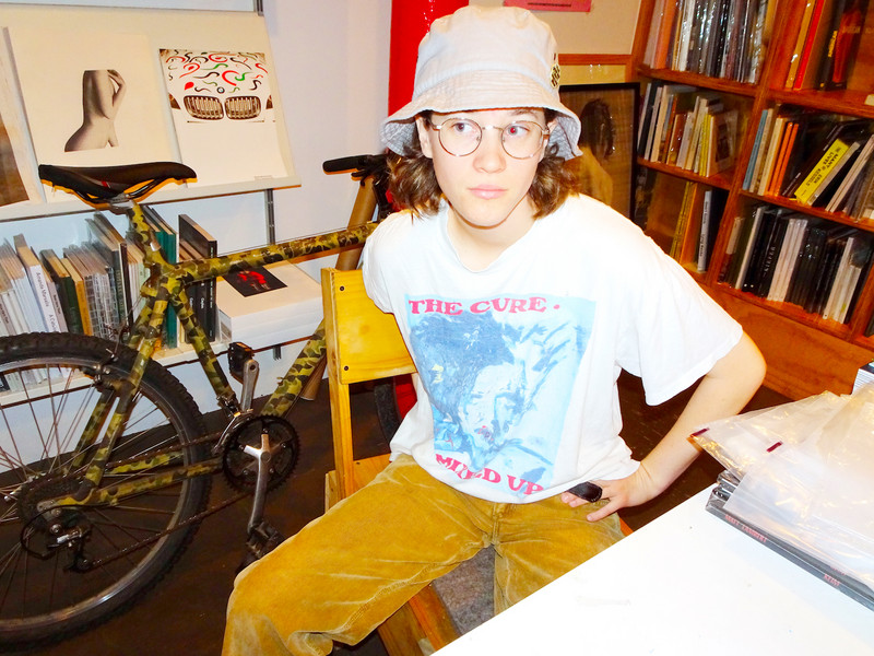
Describe the interplay between the publication and clothes, if there's one at all.
Well, there is an interaction with SUNNEI on the cover, which features their striped pattern, and the idea of the ROSSOVISORE it’s fun if you consider that it can be worn, kind of. However, there hasn't been a direct correlation between the clothes and the publication. Still, we believe that what unites us is the care for the finished product and the attention given to each phase of the process. For us, today a book is not just a medium. It becomes, in some way, an object. In a world where information is predominantly consumed on screens, a book is a tangible element, and this is something we greatly value. We choose paper, and we consider the tactile aspect of the reader's experience.